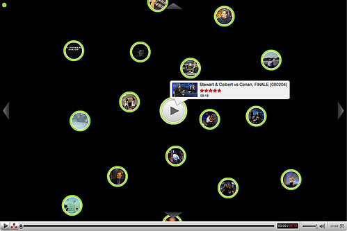
A new way to waste time on YouTube
Ooo... pretty...

You see that little red thing in the corner that looks like Brainiac's logo thing? Well it shows up when you go into full screen mode. Once you click it you get this nifty new way of browsing.
Nothing monumental, but YouTube is the most popular web video service and it's worth mentioning when they come up with some new (well not really new) way of interfacing with viewers.
With YouTube's popularity, can it be long before we start seeing adaptive GUI's such as this on other sites? Amazon? eBay? Best Buy? Facebook?
Heck in photo circles, vignetting is all the rage right? It could catch on.
Labels: design, multimedia, youtube


<< Home