The best layout in the history of newspapers (take a long hard look)
Do you see it?
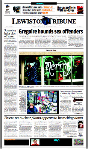
No? Focus on the center. Take a look at the two pictures, and no they aren't from the same story.
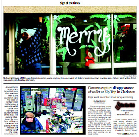
It maybe hard to read here, but the top image is a stand alone feature and the one below it is a news story on a stolen wallet, the surveillance camera that caught it on tape and pictured the suspect whose identity is unknown.
One word: "..."
Checkout the PDF for a better image.
Enjoy.

No? Focus on the center. Take a look at the two pictures, and no they aren't from the same story.

It maybe hard to read here, but the top image is a stand alone feature and the one below it is a news story on a stolen wallet, the surveillance camera that caught it on tape and pictured the suspect whose identity is unknown.
One word: "..."
Checkout the PDF for a better image.
Enjoy.
Labels: funstuff, humor, journalism, layout, news, photojournalism



<< Home